
Top tips for spring/summer styling
Styling your home for summer can be overwhelming - it can be hard to work out what theme you want, and how to style it for so it fits in with your existing decor. Luckily, our designer, Lizzie sat down with us and shared her best tips for styling this summer and spring season, and what trends you should be on the lookout for.
Don’t discard the classic colours
Brightening a room is as easy as sticking with a classic colour scheme - crisp whites and natural tones are great for both big and small spaces. Our Parisi White is the perfect summer and spring number. Pair this ornamental bedspread with an arch mirror, a large fiddle leaf and velvet accessories - Lizzie notes these are great ways to tie everything together: “Add a mirror, opposite a window to bring in light if the room is dark. The reflections can make the room look bigger. If you’re lacking storage, opt for under the bed storage which can be hidden by a valance!”
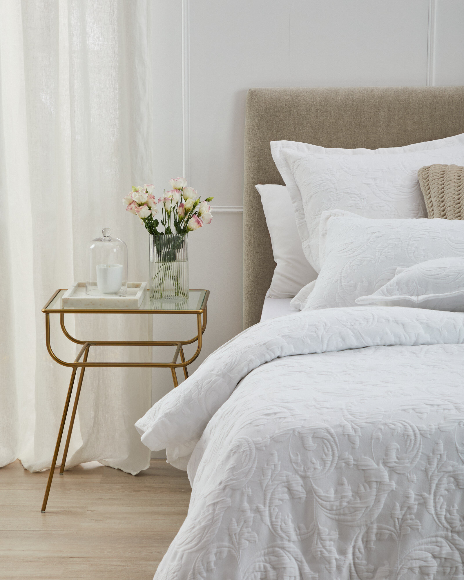
Parisi White
But if you can’t stay away from a splash of colour, weave it in!
“Play with different textures and coloured cushions” says Lizzie. If you’re opting for neutral tones like our Marina Linen or Philomena Dove, rich and bold can be a great way of adding some extra luxe - even in summer - sage green, terracotta, blush pink and pastel blue can be fun colours to add into a room.
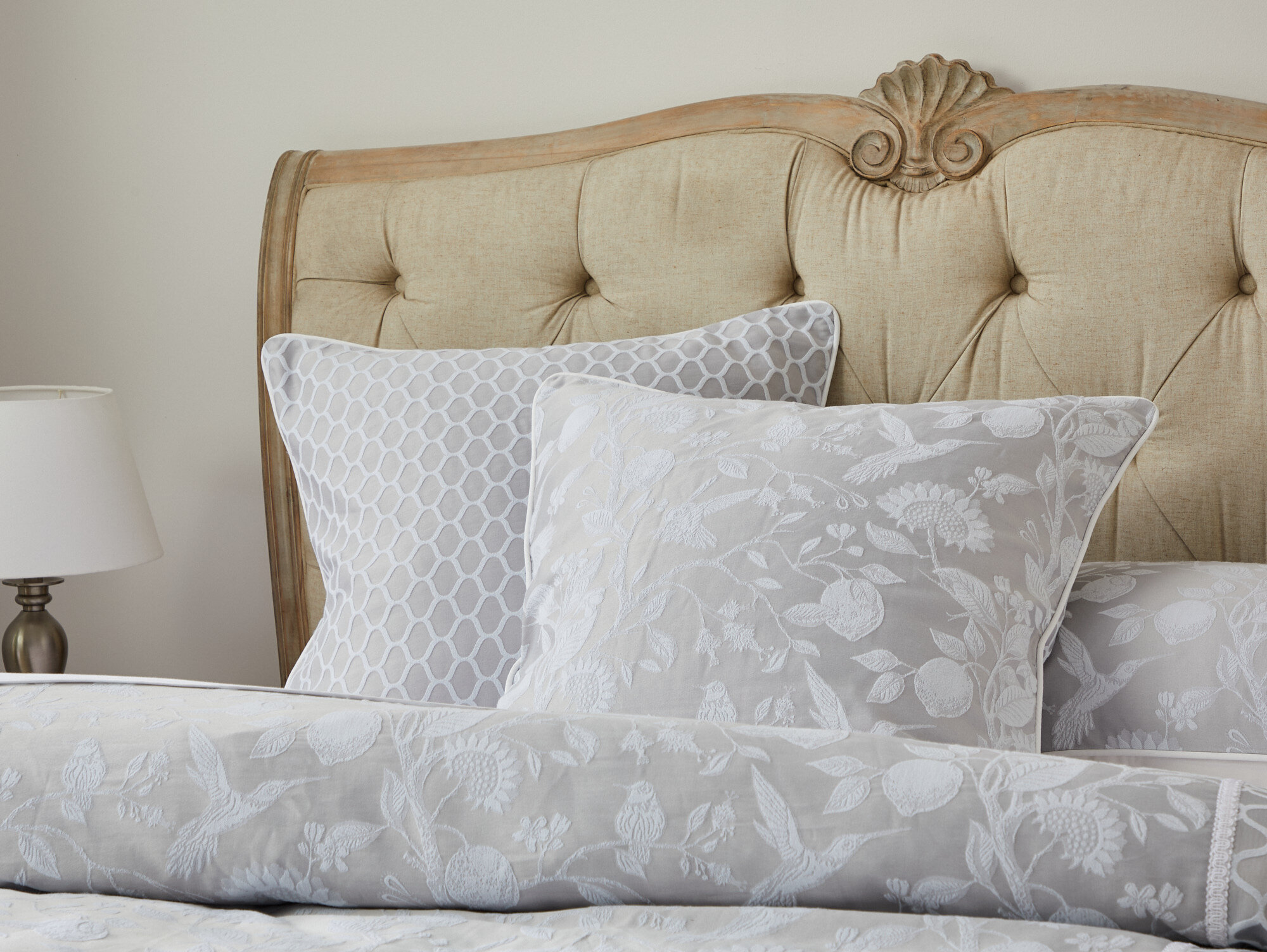
Philomena Dove
If you’re spending some extra time at home, make sure you reflect this in your space.
The bedroom is where we unwind and relax after a long day, so reflect what you love. If you’re a reader, create a nook with a comfy chair, cushions and a throw. If you are wanting a zen space for meditating - add a rug, some fun plants in pots, a low bookshelf and some fresh candles. “Think of it as an oasis – bring in anything that makes you relaxed and give you a break from working and schooling from home.” notes Lizzie.
How to begin? Start with something simple!
“Monochromatic tones are a great way to start styling. Pick a colour you love in a neutral colour - white, beige and cream - and then play with texture. Just be sure to add a break of colour somewhere!
When picking a colour palette think about the light in the space. If it is dark, then try to do lighter colour palettes - white and mix into shades of linen like our Olinda Dune cover. If the space is large and bright then go bold with the base like a charcoal - I love our Malucca Forest cover with it’s tonal greens and pops of gold.”

Malucca Forest
Want to view the entire collection? Download our lookbook here.